


In our previous articles, we discussed framing and lighting, but as in a holy triad, the key element missing to complete the artistic combo is color storytelling.
With colors, we can set moods, tones, and themes. Color is the charismatic brother of Light, and both interact as one in this regard. From a psychological point of view, you can use a determined color to energize or to cool down a particular scene.
Let’s start at the very beginning.
History of a wheel
The color wheel is the basic tool for combining colors. But in order to find the first circular diagram in history, we need to go way back in time and meet Sir Isaac Newton, who experimented with prisms in the eighteenth century getting revealing results.
He “published” a book called Opticks, where he made a breakthrough in proving that light was made of different colors.
Controversial at the time—as it was thought that pure light was colorless—his experiments became important stepping stones for color theory.
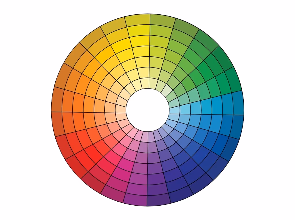
His experiments led to the theory that red, yellow and blue were the primary colors from which all other colors are derived. While that’s not entirely true, it’s still influential in the color wheels developed in the early 1800s as well as the color wheel currently used today for the subtractive model.
Add to that the secondary colors of violet, orange and green—those which result from mixing the primary colors—and the color wheel begins to take shape. The tertiary colors yellow-orange, red-orange, red-purple, blue-purple, blue-green and yellow-green complete the color wheel.
-Nevertheless, on computers and television screens we most commonly see the additive color model which begins with darkness and uses different colors of light mixed together to achieve white.-
But it was Johann Wolfgang von Goethe with his theory of colors and Michel Eugene Chevreul with his Law of simultaneous color contrast that really founded the documents of color theory and the term “color psychology” was coined. This was the cornerstone for a whole entire market like the one we have today, that bases its entire design and identity on the way we perceive all the colors from the wheel, using those to make us react as they need.
Spinning the color wheel
Before going too deep on the psychology involved and related to colors, there are a few concepts I would like you to start grasping about this subject. Usually, these concepts are used in a wrong way so let’s dissect those using some practical examples.
When mixing colored light (additive color models), the achromatic mixture of spectrally balanced red, green, and blue (RGB) is always white, not gray or black.
Tints, shades, and tones


Color harmonies
There are different combinations of colors based on their relationship to each other, inside the color wheel. As with music, the harmony is present in colors. They are pretty simple to understand and mimic once you learn how each color is placed on the color wheel.
If you’re wondering how those color schemes look, below you’ll have a few practical examples of the most common ones.
Complementary color scheme
Any two colors opposite each other on the wheel are considered as complementary colors.
This scheme creates contrast in the frame, such contrast can be used as a tool to give accent to depth or suggest protagonism.
I’m sure you have seen this scheme used in Architectural Visualization a million times, due to blue and orange being opposite each other and due to orange and teal being one of the most used moods for exterior architecture visualization.
Orange and teal can be considered the opposite because this scheme allows tints and shades over any of the colors.

Analogous color scheme
I personally like this scheme a lot. Analogous color schemes use colors that are next to one another on the color wheel. You can see this scheme in nature, over a grass field or on a fruitless tree top or in pretty much everything generated by particles that include random decay on those.
In 3D software, we use it without knowing sometimes, when we try to add randomness and variation to a surface by slightly tweaking the hue of a color.
In general, when creating an analogous color scheme, one color is chosen to dominate, a second to support, and a third (along with blacks, whites and grey tones) to accent.

Triadic color scheme
A triadic color scheme is when three colors that are evenly spaced around the complementary color wheel are used in conjunction. You’ll find this scheme on the ultra-modern interiors where the furniture fabrics, artworks, and wall paint will try to explode the contrast in this fashion.

Split-Complementary color scheme
This color scheme tends to soften the complementary color scheme and is a combination of complementary and analogous. In essence, complementary colors are chosen and then the colors on either side of them on the color wheel are also used in the design. It’s considered to soften the impact of a complementary color scheme, which can, in some situations, be too bold or too harsh on the viewer’s eye.

Rectangle (tetradic) color scheme
Tetradic schemes utilize two sets of complementary pairs: four colors. These can create very interesting visual storytelling experiences, but they are hard to keep in balance. Why? It’s because one color of a tetradic scheme needs to dominate the other colors without completely overwhelming them. An equal amount of each color often leads to a very awkward look, the last thing you want your users to see.

Square color scheme
The square scheme is a variant of the tetradic scheme. Instead of choosing two complementary pairs, you place a square on the color wheel and choose the colors that lie on its corners. Therefore, you’ll find four colors that are evenly spaced at 90° from each other. Unlike the tetradic color scheme, this approach often works best when all the colors are evenly used throughout the design.

Again, I can’t stress enough the idea that these are all made up of guidelines. Highly subjective. Nevertheless, this is part of the history of color theory and we all should know about it.
The physiological side of colors
We’re going to go even further into the land of subjectivity.
The cornerstone of this idea could be tracked to the idea of warm and cold the colors can give us.

Warm colors, these are colors located on the half of the color wheel that includes yellow, orange, and red. These colors are said to reflect feelings such as passion, power, happiness, and energy.
Cool colors are colors located on the other side of the color wheel, including green, blue, and purple. Cool colors are said to reflect calmness, meditation, and soothing impressions.
Neutral Colors – These are not said to reflect any particular emotions. These colors include gray, brown, white, and black.
Ok, but how does this look when it’s applied to rendering and visualization?
Well, it’s really pleasant to look at.
Think about the concept of complementary colors- two opposite colors from the color wheel like the warm orange from a soft light that fights against the cold blue that covers a brutalist piece of architecture.
Notice how the contrast in terms of color scheme is also enhanced by the feelings attached to the concept of juxtaposing the warm and inviting against the cold and boring look of a concrete wall.
You will find a lot of examples in archviz using this combination.

What if we want to provide a sad, flat and nostalgic experience to the viewer? well, as with the music when you play minor chords, you can play with the analogous color scheme, tinting some colors near each other in the color wheel.

But you can try to experiment with any of the color schemes mentioned above.
You will find yourself really quickly playing with combinations that are really pleasant without guessing, but following a guide.

A guideline is not a rule. Art has no immutable rules, but it isn’t harmful to know which are the rules to know how and why to bend or break them.
Keep all this content in mind and surf the web for more information. Color theory is one of the most relevant topics for artists, and Color Theory In Architectural Renderings reflect the same principles. This article just grasps the idea of the theory based on history.
To really understand color grounded on digital art I strongly recommend The Hitchhiker’s Guide to Digital Colour by Troy Sobotka.
There is a massive difference in how we understand colors from a psychophysical point of view and how a display shows us the colors by light emission on each of the RGB lights.
But that's something we can discuss in another article.
Credits:
Joni Mercado is a 3D artist and Blender user since 2007. Developing himself as a freelancer on several areas of digital art such as Architectural Visualization, Virtual Reality tours, Augmented reality, and game prop artist.
Register Now and Get $50 FREE Credits!