Why it’s important?
At the heart of any good image is a visual story. We take cues from various elements arranged by the creator of the image, and consciously or unconsciously deduce a narrative or an impression of one. We can find narratives in anything from a photograph to a painting, and it’s when we do that we are transfixed by the image.
We associate narrative with the written story or anything that is representative of a story, but in art and design, we can also use it to describe the interplay of visual elements that create visual events within a framed image. When shapes and colors coexist harmoniously, they instill in us a compulsion to investigate them, and our eyes begin to move from one part of the image to another. This progression is what gives us the often verbally inarticulable story of an image.
Everyone’s heard the saying “a picture is worth a thousand words”, and it’s so cliche I almost regret even mentioning it, but the reason this is a commonly accepted notion is that we not only get a depiction of a moment or situation, we’re also treated to the interaction of design elements, that tell a story of their own, and the best images have both narratives working to bring forth a suggestion.
That we, in some way, open ourselves to suggestion when we are struck by an image, makes pictures an essential tool in the advertisement. The Architecture industry, like almost every other, is always in need of images that not only depict a concept but captivate a client into investing in the product it represents. Seasoned designers for archviz renders are aware of the importance of visual storytelling, and apply it to their visualizations all the time. In this article, we’ll have a look at some of the commonly used devices for visual storytelling, starting with:
Context
Context is what we would say describes circumstances that play together to serve as a stage for things to happen, or to just be.
We can perceive context straightforwardly in character design, for example, where through elements in a character’s clothing and accessories we can easily determine his or her occupation, the period in time he or she might live in, and the natural conditions in the place he or she inhabits.

If this image intrigues us enough to have a closer look, we might make the following inferences:
- His clothing suggests he is from Europe, in the 15th or 16th century. The ornateness of his garments and accessories suggest he operates in urban environments. His stance and obscured face as well as the light weaponry suggest he operates in stealth, and deals in murder (ooooh scarrryy!).
- All of these details spark a world of questions and speculation that begin to create a story around this character for someone without knowledge of who this guy actually is.
- We might imagine him moving around a city of stone and marble, where the white of his clothing might help him blend in with his surroundings. We might picture him as someone of stature within some sort of organization which would explain his opulent, more ceremonial than functional clothing. Depending on how taken we are by this picture we may go even further, but the point is the design of this character encourages us to imagine a world around him through the various elements that suggest context. A context is a powerful tool we can use to build a story on a piece, even though it may not be as clear-cut as in designing characters like this.
Architectural visualizations can do the same thing, but the suggestions would center more around the atmosphere and would spark the imagination of the future inhabitant of space, playing to his or her inclinations, and reinforcing his or her sense of who he or she is.
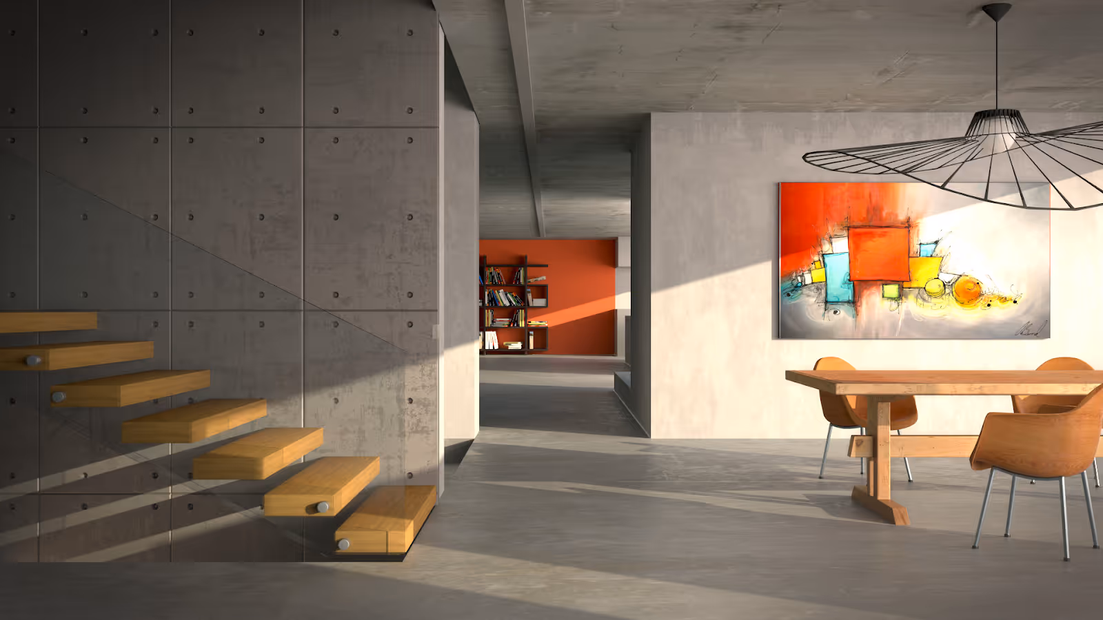
Let’s take this lovely interior for example. It’s very bare but arouses a lot of visual interest. We might think that the person who would live here as being a very no-nonsense type of character who keeps to the bare essentials, but far from dull. The concrete walls have distinct textures, the warm colors on the far wall, painting, staircase and table set are positioned such that the grey is broken up, and isn’t overwhelming. The natural light flowing from the right side of the frame suggests a wide window to accommodate the sun, which bathes the room with a subtle yellow, that makes it feel very homely and inviting.
We can also see that the inhabitant is an avid reader and an appreciator of art. The playful design surrounding the ceiling light puts to rest the suspicion that the inhabitant is purely utilitarian. Likely male, or at least possessing a quite masculine aesthetic, and having the quiet, deliberate disposition of a traditional artist or art critic.
We’ll come to our own interpretations, naturally. But the idea is to produce a space that would appeal to a client’s character.
So now that we know what we’re trying to achieve, we should get acquainted with devices we can use to achieve it. Here, finally, are the tools we can use to build a story around our pictures.
From here on in, we’ll have a look at renders from the amazing, Tomasz Sobol, our resident wrangler, and 3ds Max + Corona wizard.
Color
Color is arguably the most subjective aspect of any visual work. The interaction of colors to each other, or even to an absence of color is something personal. We betray our preferences in how we dress, where we like to hang around, and of course, where we live. Although in this article we’ll attempt to give an accessible overview of the devices used in visual storytelling, we will need to get a little technical with color.
Color is also closely involved with light. In visual art and design, color temperature is used to create a distinction between colors moving towards red and blue. To put it simply, we consider the reddish colors as warm and the bluish colors cool. Warmer colors tend to produce a more comforting atmosphere, but cooler colors can lend a sense of elegance or mystery. The combination of colors in a space, whether from the surfaces themselves or the light sources, contributes to the overall atmosphere of a picture. Both warm and cool colors tend to exist in space, and in painting, for example, it is understood that warmer light produces cooler shadows and vice versa.
Each known color has several gradations. These gradations are known as Hues, and they determine whether the color is more orange, or more purple, for example. Considering the hues of space is essentially considering what colors will occupy it, independent of how “bright” or “rich” they are.
“How yellow is this yellow?” might be a question you’ve asked yourself at one point or another. The “yellowness” in question is what we can attribute to saturation. Saturated colors tend to draw more attention, and are sometimes described as “loud” while less saturated colors are sometimes called “ muted”.
This image is littered with different Hues - pink, lavender and yellow are the key players here. The yellow elements all vary in saturation. Notice how the yellow in the painting is richer than in the lamp to the far right, for example.
Color can describe how “light” or how close it is to white a particular gradation of color is. If you grew up with coloring markers or crayons, you likely encountered the descriptors, “light blue” or “dark red, which told you the value, of the color in question. The terms tint and shade are also used to describe how much white or black is mixed with a color, respectively.
Now that we have an understanding of color and its properties, let’s revisit Joni’s work.
We observed earlier that the abundance of warm colors (yellow, orange and red) over the gray walls and floor provided a nice warmth to the room, despite the grey. We might now add that the level of saturation from the stairs to the back wall increases and that we experience a pleasant break from the lighter and darker oranges through the blues and yellows in the painting before our eyes wander to the orange in the far back.
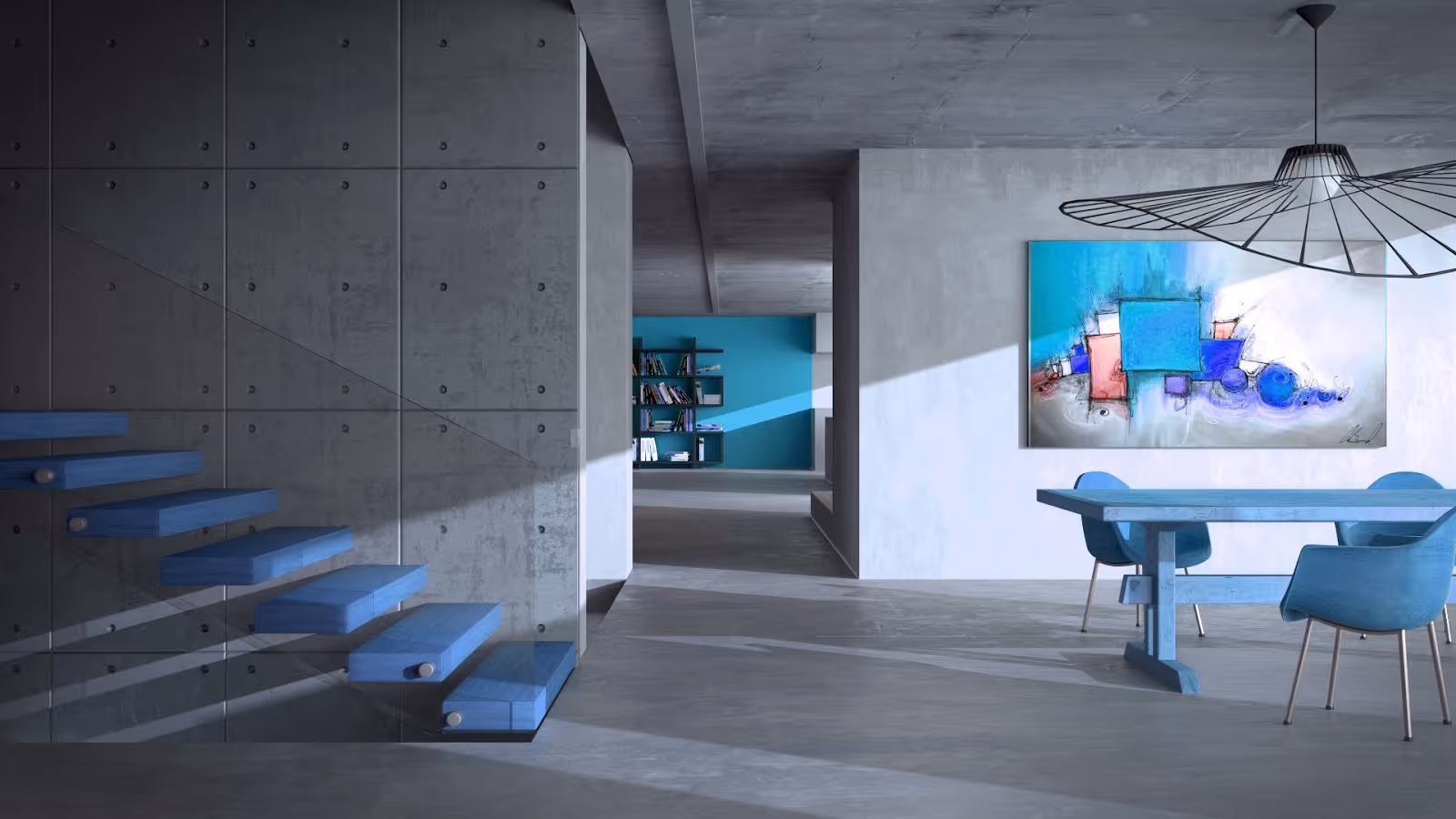
The warm colors would surely be too much if there were any more, and so the grey allows these colors to be arranged in the space to let the room feel quiet, but with little bursts of sound to break the silence. Because the colors used in this picture are sparse, and very close together in terms of hue, we can appreciate the contrast in saturation. A change in color hue amidst all that gray in the room could suggest a different sort of inhabitant entirely:
We observed earlier that the abundance of warm colors (yellow, orange and red) over the gray walls and floor provided a nice warmth to the room, despite the grey. We might now add that the level of saturation from the stairs to the back wall increases and that we experience a pleasant break from the lighter and darker oranges through the blues and yellows in the painting before our eyes wander to the orange in the far back.
To learn more, read our article about Visual story telling through color.
Light
Light has a hand in many aspects of building an image. It brings out the form of your elements, establishes a mood, showcases detail and can add visual interest on relatively uniform surfaces.
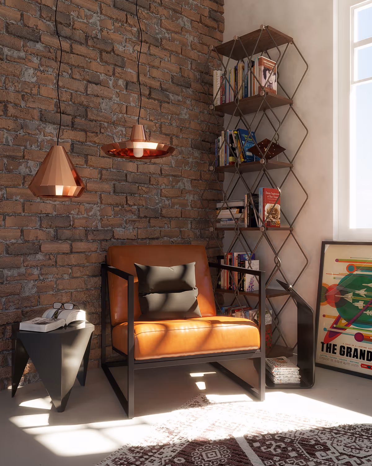
In this image, for example, the light spilling in from the window brings out the creases on the chair’s upholstery, casts a shadow from the window frame that breaks up the form of the seat cushion and throw pillow into smaller, more interesting shapes, and blows out just enough texture from the rug to call more focus into what’s going on with the chair.
With just the consideration of how the light source would interact with the objects in a scene, what would have been relatively mundane subject matter can become an interesting interplay of various shapes- and even in that alone, an intriguing visual story.
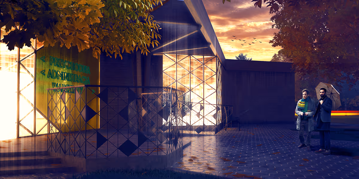
This image is a fine example of how the absence of light plays just as important a role in crafting a visual story. This is a visualization of the Warsaw Modular Clinic. While most of the detail of the actual structure falls into shadow in the receding daylight, the warmth of the inner lighting against the cools of the shadowed exterior highlight the accommodating nature of the clinic.
It isn’t hard to put yourself in the place of the two men to the right and feel the allure of the facility against the cold dusk winds. On a design level, the lit areas serve as accents throughout the frame, and provide the visual interest, but are balanced out by the shadows so as not to make the image too busy.
The subtle details in the floor tiles, window panes and railing imply the design of the structure amidst the shadow. These elements make the image a welcome place for tired eyes and help the architectural visualization depict, to great success, the Modular Clinic as a modern hospice- a place of care and comfort.
Composition
Our eyes are adapted to focus on one thing at a time, and we often establish in our minds a sense of direction when shifting our focus from one element to another, especially in an image. Within the frame, we can create a sense of movement by laying out elements so that the viewer’s eyes are led from one place to another, or at least to one place first before being left to explore the rest of the image.
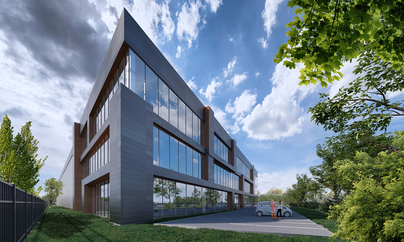
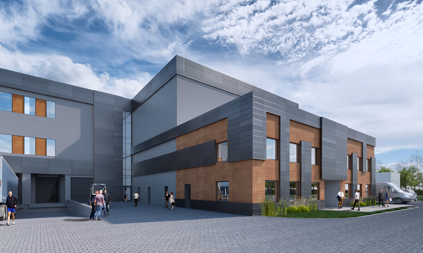
This exterior visualization makes use of perspective and contrast to direct our attention to the building first but in an inostensible way. We often look at whatever is the center of an image first, and while this would have been a more straightforward way to frame this image, placing the subject off-center makes the image a little more dynamic by creating a starting point of focus and a destination point. Much like in a story, there’s a clear beginning and a clear end.
The building is rectangular, but through perspective, we get a triangular shape, with the apex clearly defined against the sky. Our eyes naturally travel from this point to the other end in a diagonal line, and in that journey, we take notice of the people and the car, as well as the foliage receding into the distance. This puts emphasis on the depth of the structure, making it even more as though we are seeing it from within the actual location, as well as making it more visually interesting.
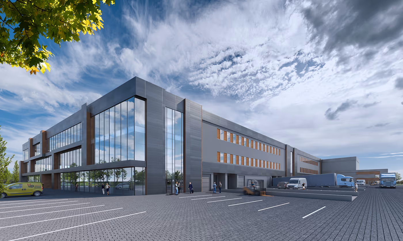
Here is another shot of the building, that uses the same devices, but with the perspective distortion less apparent, and with the parking lines now serving to direct our eyes to the prominent corner of the building before moving towards the vanishing point of the scene.
In this variation, we get the same thing but with our attention called left of center, to the lower half of the picture. We now see more people moving about the structure, like we would on an everyday encounter, but with the hard edges of the building providing us a place to focus on amidst the small crowd. You could say this gives us a more grounded view of the complex. It helps us assume the role of one of the people in the frame.
Now that we’ve identified how the clever arrangement of shapes within a frame provides directionality and dynamism to an image, let’s dip our feet a little into the techniques used in the composition.
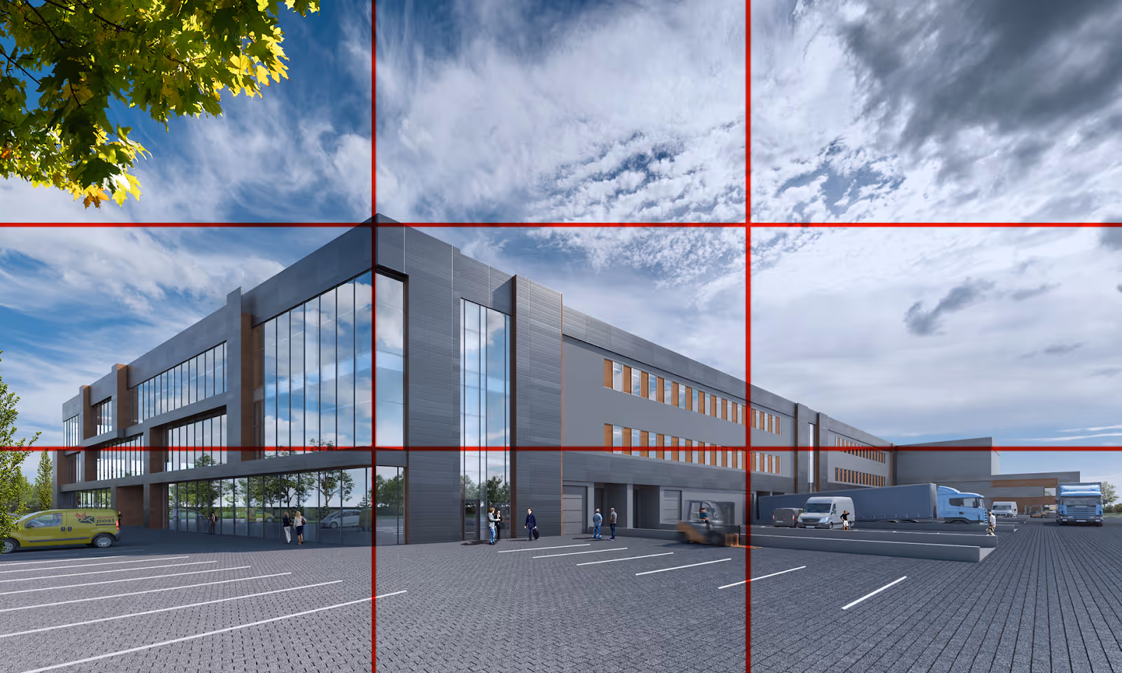
The composition in the second example in this section can be explained using a basic composition guide called the rule of thirds.
We see that the image is divided into a grid of 9 even squares, with the prominent corner of the building aligned with the upper left intersection between the vertical and horizontal lines. Furthermore, the sharp edge of the form shoots downward to establish the first vertical division on the leftmost side. We can use the rule of thirds to bring focus to elements in a frame by positioning them at one of the intersections in the grid, as Tom has done here.
That’s All for Now!
We now have a starting understanding of what goes into building a rich and compelling image and creating an underlying drama through the consideration and use of a few simple devices. We also know now that even everyday subject matter can be elevated into something more through visual storytelling.
In the succeeding articles we’ll be having a more extensive look at each device, and learning techniques specific to Color, Light, Composition, and more insights from season Archviz designers, so stay with us. We’ll see you soon!
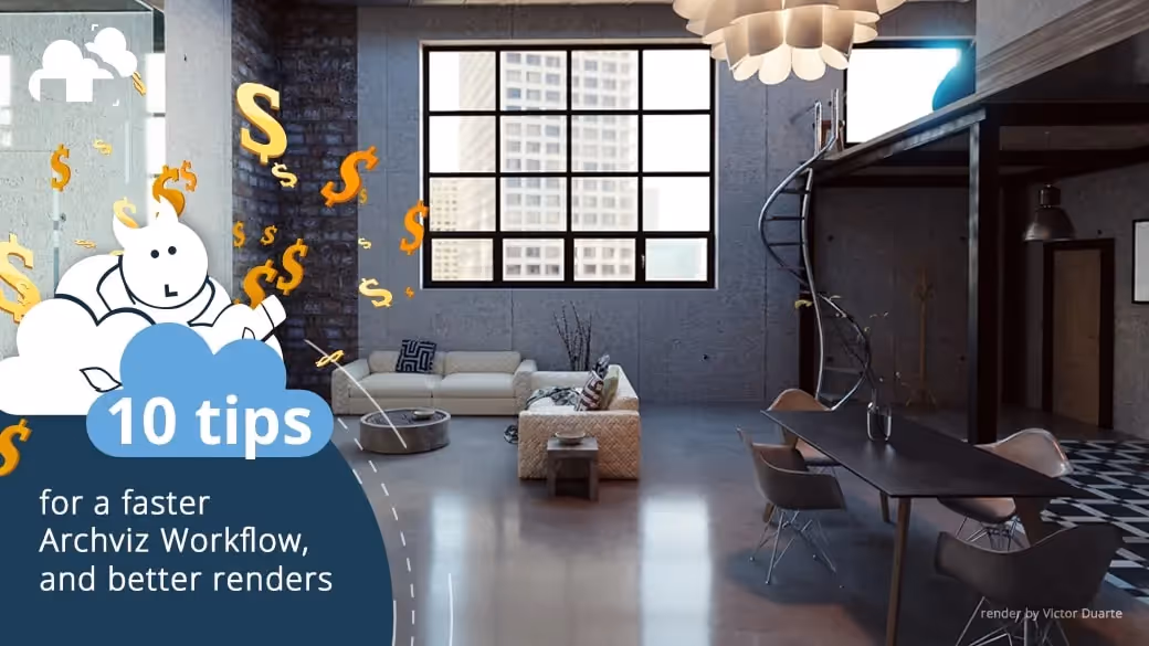
Register Now and Get $50 FREE Credits!