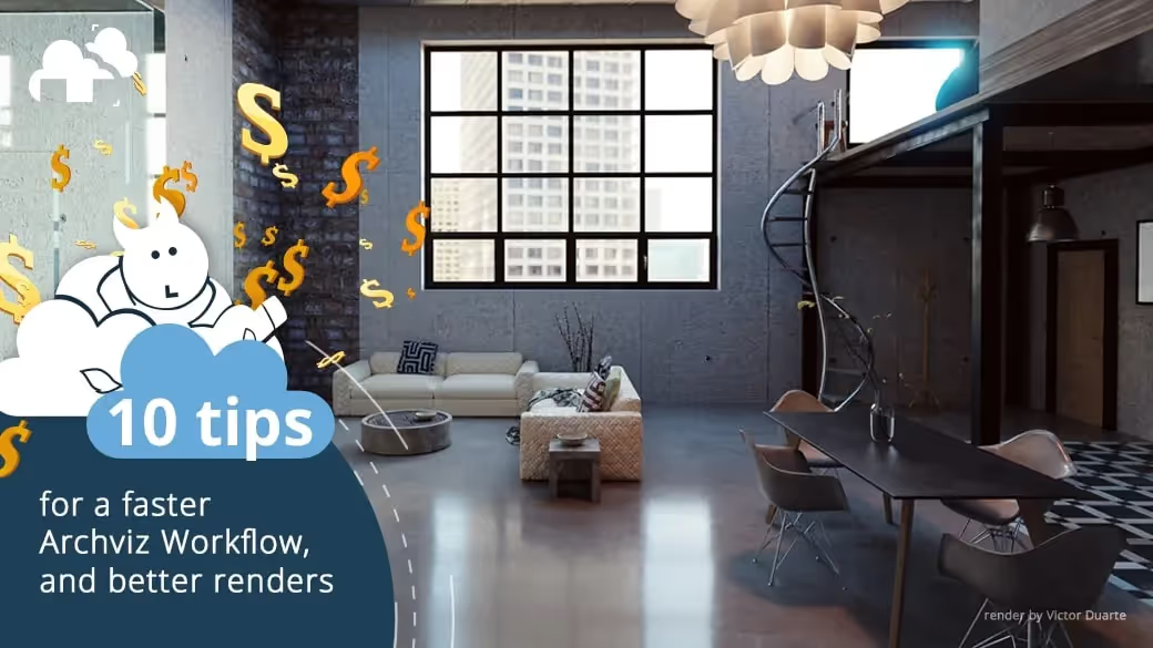
If you’ve been plying the Archviz trade for some time, you may have relished that moment when your client’s jaw dropped to the ground after seeing your visualization for his new luxury condominium suite. The volumetric light falling sweetly on the ornate glassware you set on that solid ash wood veneer dining table by Roche bobois. “It’s beautiful! B-but how in the world..?” He may have said, barely holding back tears of awe and bewilderment at the digital sorcery you conjured from nothing.
Or not.
Before we go any further, An archviz render, short for architectural visualization render, is a digital image or animation used to visually represent architectural designs. These realistic renders are created using specialized software and can be used to showcase design concepts to clients, investors, and other stakeholders in the building process.
3d rendering for Architectural Visualization has been around for a couple of decades now, and it’s proven itself to be an invaluable means of selling a concept. That means most clients in the last 10 years or so are aware of the technology and have expectations that increase as your favorite 3d software churns out releases. Competition is fierce, and the market is filled with extremely skilled designers who seem to be able to create in a day what would take you weeks of ingesting huge amounts of caffeine and dying inside.
This is the uncomfortable truth of the seemingly evergreen Archviz business, but it doesn’t mean you need to be a relentless CG mutant to thrive. While good modeling, texturing, lighting and staging are always key ingredients to success, an overlooked aspect of 3d visualization is working efficiently, and also employing techniques that are less specific to 3d production and more about creating visually pleasing work. And if you’re unsure of what exactly this entails, sit tight. Here are some Archviz tips to help you produce better renders, and a workflow for archviz that leaves you with enough time to have a life outside of your workstation.
WORKFLOW

You’re a hardcore 3d designer. You’ve spent years perfecting every aspect of your craft by challenging yourself and making everything from scratch. That’s respectable but impractical in today’s industry.
Pushing yourself is something you should always do, but at work, efficiency is the name of the game. Don’t be afraid to do whatever it takes to speed up your architectural visualization workflow, so you can spend more time focusing on refining your renders, which in the end, will determine whether the work you put into your project was even worth it to begin with. Here are a few ways you can still get quality results across your pipeline, and avoid missing the forest for the trees in your client work.
1. Use Assets
Fleshing out an Architectural draft with precision, texturing floors walls and ceilings with elaborate node setups for those fine grains of dust to sell the realism, lighting the room to perfection – all of these are make or break stages in your pipeline. Then there’s the furnishing to think about, and we both know a couple of plants and a book table won’t cut it. Luckily, many in the biz are aware of that problem, and quite a few have decided to help solve this by providing assets in bundles for a reasonable price! Chocofur, iMeshh, Evermotion, and CGTrader are just some of the more popular providers out there, and the list keeps growing. Factoring in a budget for assets may set you back at first, but once you’ve built a relatively large collection of them (or subscribed to a monthly plan that gives you access to bundles), the time you save thanks to those assets will quickly make up for it. More time means more projects or more opportunities to sideline, so anything that makes it easier to add assets to your 3d app is always a plus. For 3ds Max users, 3dbee.it is a new service that allows for drag and drop functionality from their asset manager directly to a max project, with shaders and textures automatically set up for render engines like V-Ray, Corona and Arnold.
2. Use substance

Texturing is something you either love or hate, and more often that not, that’s determined by what tools you have at your disposal to texture your objects with in the first place. If you like browsing through sites like ArtStation to see how the competition is looking, you might notice that Allegorithmic’s Substance suite is at the core of a lot of the staggering renders out there. With a reasonable pricing plan (which will hopefully continue to be reasonable after Adobe’s acquisition) and the shallow learning curve (at least for Substance Painter) plus the vast library of ready to use presets available, Substance’s usefulness is unquestionable, and if you’ve never particularly enjoyed texturing, you might find yourself rediscovering it after spending some time in this suite.
3. Use addons

Light setups, camera rigs, crowd population, tree generation – the number of third-party plugins available to the different 3d programs widely used today are virtually uncountable! Pay a visit to an online market to see what’s out there, and you may just find solutions to a lot of your production problems. If a client wanted an aerial shot sequence of his building on a busy street completed in two weeks, would you have thought that impossible? If the answer is yes, time to make some key additions to your bag of tools
4. Use render farms
Time is money, and so is an out of commission workstation. Using a render farm allows you to send your projects off to render their frames in parallel, cutting your render times down exponentially, and leaving your personal machine available for other work or some well deserved R&R with the latest installment of your favorite RPG series. Most clients are aware that some budget must be set aside just for rendering, but if anything goes wrong, it’s on you. Find a render farm that offers a level of support that lets you sleep at night, and be sure to give this article a read for a quick rundown of all the need-to-knows about choosing the right farm for you.
TWEAKING
The refinement stage of a project can often be the hardest stage, mainly because problems are harder to identify, and are mostly in the realm of “taste”. You can run operations that detect bad geometry, you can spot UV issues on your models almost at a glance, but what do you do if the whole shot just falls flat, regardless of how meticulous you were? Here are a few things that you can consider.
1. Make sure cam is eye level
So you’ve modeled, textured, lit and staged your Architectural render. You’re about to hit that render button and call it a day, but something is wrong. Your picture just doesn’t feel quite right, even though the models look great, the composition is sound, and you’re loving the light setup.
Cases like this might very well just be a matter of perspective, but don’t load your Ted-X playlist just yet. Check if the distance from your camera to the ground approximates eye level. If you mean to make an aerial shot, give your camera a height that establishes it, and leaves no room for speculation. Keep your camera at distances that are achievable in real life. 5-6 feet above a floor and for aerials, within 400ft, which is within the legal limits for drone photography, for example.
2. White balance
A big part of selling realism is replicating the physical behavior of light as it bounces around your scene. Since light never hits a surface in a vacuum, the color in your scene is a direct result of all the reflected color from the surfaces you modeled, or in cases where you use an hdri map, the surfaces the light has interacted with in the physical environment from which the map was made. Let’s say you’re visualizing an interior garden, with a huge opening for natural light, and while you’re loving that hdri map you selected for this scene, you’re not too keen on the predominant blue coming from the sky. This is where white balance comes in handy.
One way to use white balance is to create a primitive with a shader set to white and sample the values of those primitives from a test render.
If on your 3d software, you set your white level to the sampled value, you offset the color cast with a color temperature that brings your white values closer to neutral white. This gives you a look that more closely resembles how our eyes perceive light in real life.
3. Exposure

With a primitive as mentioned above set the color value to 18% grey or (0.18 for R G and B channels) and generate a test render. Look at your test render through a heatmap available in your 3d software (i.e. Filmic’s False Color profile in Blender), and adjust your exposure level until your primitive’s grey matches the grey in your scene.
4. Exploit Lighting

One of the advantages of working in 3d is the ability to light your shot in ways that would be practically infeasible to work into an actual photography session and get lighting effects without any need for heavy post-processing work. A great tip we learned from Mateusz Wielgus is accentuating key assets in your render by adding some rim lighting to them. You can also read our articles about Lighting principles for 3D artists and Light: The art of exposure.
5. Subtlety is key
Spending hours tweaking a project can start to do things to your perception of the work, but in many cases, there simply isn’t enough time to leave your computer and refresh your eyes. This invaluable trick is something one of our Live Stream guests mentioned in our time together.
As Joni Mercado puts it, if you feel something needs to be turned down to a particular value, use half that value instead.
6. No such thing as Pristine
In subtle amounts (see point above) some dirt on your surfaces can go a long way in selling a realistic Architectural Visualization. Whether it’s some dust in the air or a barely noticeable fingerprint on a piece of glass, adding interactions on your objects from the real world can add an even deeper sense of what your render would look like once actually constructed.
Well, that’s about it. We hope this article gave you some insight on the aspects of Architectural Visualization (or in many cases 3d content creation in general) that are less talked about. Remember that while these tips were collated to help you work more efficiently and help in dealing with the more abstract parts of the design, they are not meant to invalidate the habit of challenging oneself and honing skills when possible. The level of quality that clients look for will keep going up, just as more and more tools and resources show up on the market. Keep learning, keep growing and as always, happy rendering from all of us at GarageFarm.NET
P.S. If you create Architectural Visualizations professionally, and need some help in the
rendering department, take a look at our Archviz render farm
Further Reading:
Learn to manage your time effectively when working on a job
(https://garagefarm.net/blog/planning-for-success-how-to-estimate-and-manage-time-when-working-on-your-archviz-project/)
Register Now and Get $50 FREE Credits!


