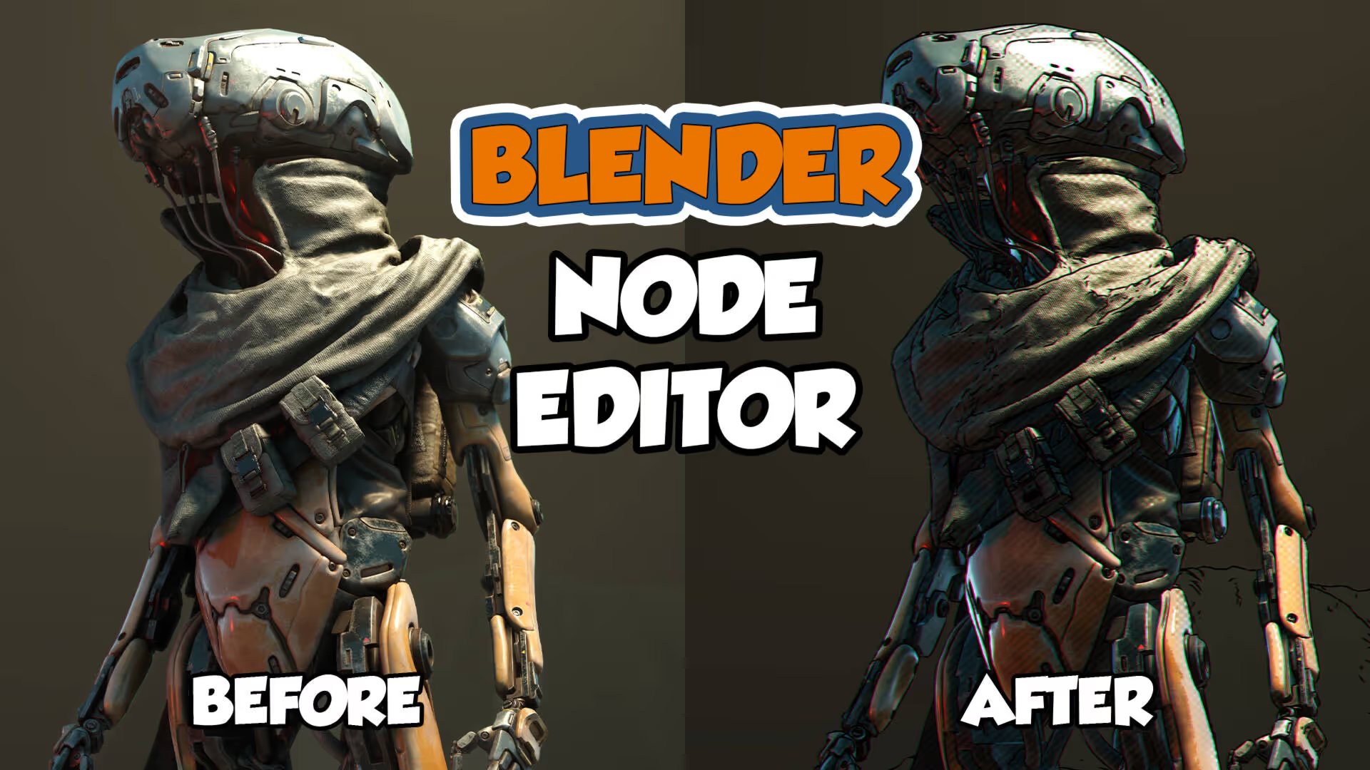
Spiderman: Into the Spider-Verse has been hailed as one of the best animated movies of all time. A big reason as to why it was so successful was because of its comic-inspired look, paying homage to the printing process used back during the golden age of comic books.
For the artists behind the Spider-Verse, it was a unique challenge that they faced head-on. But like most problems, it’s easier to solve them by breaking them down into smaller pieces. Let’s start by breaking down each component of the Spider-Verse.
In the movie, they used three different techniques for the look.
The first technique they used was halftoning for the specular highlights. Halftoning is a technique that’s used to simulate a gradient-like effect using only dots.
Second, they used hatching lines for the shadows. Hatching is a technique used to create tonal or shading effects by using parallel lines.
And lastly, they used chromatic aberration in order to simulate the printing errors that were common back in the day.
There are other smaller details that the artists used in the film, but for the sake of simplicity, this is going to be the base for how we recreate the shader.
Here we have a basic scene in Eevee with a basic three-point light setup. In order to access all the nodes for this tutorial, the render engine must be set to Eevee.
To begin, go to the shading tab, add in a Shader to RGB node, and then plug that into a ColorRamp node.
This gives us some control over how the lighting will behave. We're gonna use this as our base mask in order to add halftones in the highlights.
For the halftones, we can add in a Voronoi Texture, set it to Smooth F1, set the randomness to 0, and then adjust the scale.
To fix the warped perspective, add a Texture coordinate node, then connect the window output to the vector input of a Mapping node. And then from here, we can adjust the scale so that it's more circular. We can use a ColorRamp node to control how the halftones look and then just multiply this with our mask.
Next up is adding in the hatching lines in the shadows. Add in a Wave Texture > plug in our Mapping node > and then adjust the scale and rotation.
Make another mask using a ColorRamp node but this time we're gonna invert it so we can isolate the shadows.
Multiply that with the Waves Texture, add the hatching lines and the halftones together, invert them, and then multiply it with the Shader to RGB output. From here we can adjust the settings until it looks right to you.
Once you're done, select all the nodes and press CTRL + G to group them together. The background should turn green to indicate that they’re now inside a Node Group.
Name it whatever you want and we can now test this out on something much cooler like the Wanderer scene by Daniel Bystedt. All I did was set up a camera for the render.
To import the node, go to File > Append > click on the scene that contains the node > and now the node should be under “group”. Plug that in and adjust the settings as needed.
To achieve the final effect, go to the compositing tab, add in a Math node and set it to multiply to have control over the contrast.
Plug that into another Math node set to modulo, and then subtract that with the original image output. The value under modulo controls this ink-like effect.
We can mix that with our image output and then it should give us this comic-looking overlay.
In order to add some chromatic aberration, you can add in a Separate RGBA node, plug that into a Combine RGBA node, add in some translate nodes, and then offset the red and green channels on the x-axis.
Last but not least, we’ll be tackling the lineart. In the movie, the artists used a special setup in order for them to have line art like on the character’s faces, but for our needs, Blender’s freestyle option is more than enough.
In order to do this, go to your Render Properties, and then click on Freestyle.
Switch over to View Layer Properties, turn on Freestyle, add a Line Set, and here you can adjust the settings for how you want the line art to look.
And that's about it. Not as detailed as what the amazing artists at Sony Pictures Animation have done, but it should be a pretty good starting point for anyone interested in exploring shaders inside Eevee.
There are so many ways to express your vision in 3D, all you need to do is to experiment, see how things play out, and keep exploring. Photorealism isn’t the be-all and end-all, and neither is the cartoon style popularized by Pixar. Sometimes, the only way to move forward is to look back at the past.
Sometimes, all it takes is a leap of faith.
Thank you for reading, and as always, happy rendering with Garagefarm.NET!
- Amiel
Register Now and Get $50 FREE Credits!


