Key takeaways
- Gradients are experiencing a major comeback: In 2025, gradients (especially with grainy textures and blur) dominate branding, UI/UX, and product design.
- Light is everything: Mastering how light behaves across a gradient is critical to building visual depth, hierarchy, and emotional tone.
- Big brands are leading the way: Google, Instagram, and others are evolving their identities with color gradients.
- Modern gradients are versatile: They scale across mobile apps, websites, print media, and immersive displays.
TL;DR
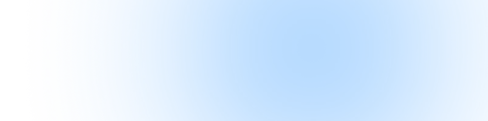
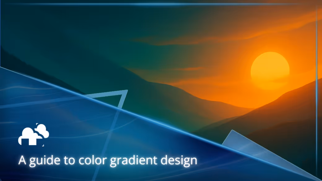
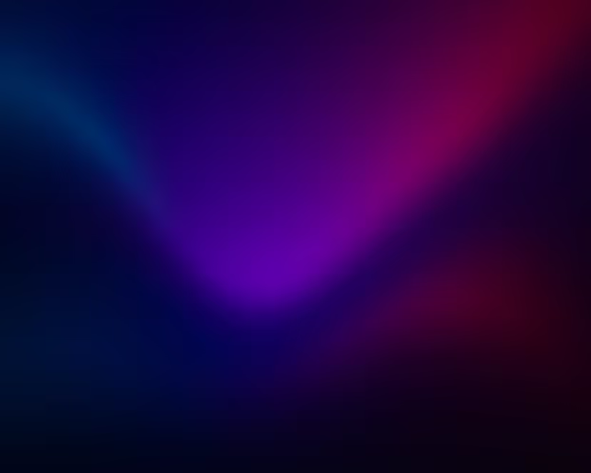
Color gradients have gone far beyond simple color transitions. In 2025, they are dynamic visual tools that inject energy, dimension, and mood into brand visuals. From “aurora” patterns to grainy retro-futurist overlays, modern gradients are tactile, rich, and memorable. With over two-thirds of major brands adopting gradients, understanding the play between color, light, and design is essential for any modern designer.
What is color gradient and why does everyone want to use it in 2025?
Color gradients are smooth transitions between two or more colors across a space. They were often seen as flashy or nostalgic callbacks to the 90s, they’ve become central to modern design vocabulary. And if you're a 3D artist looking to render some stunning gradients for your own projects, you might want to consider using a reliable render farm for your software like this Blender Render Farm to handle the heavy rendering work efficiently.
The science behind color gradient perception
A gradient is a function that interpolates color values between two points. In the RGB color model, this might mean gradually shifting values of red, green, and blue from one pixel to the next. The result is a smooth, pleasing transition that mimics how light and pigment behave in the real world.
“Color helps to express light, not the physical phenomenon, but the only light that really exists, that in the artist's brain.” – Henri Matisse
This blending isn’t just for aesthetic purposes but it also plays into how our brains interpret spatial depth, form, and even emotional cues. According to a recent study by Satyam Sharma, 67% of brands now use gradient elements in logos for their psychological pull and versatility.
From 90s nostalgia to 2025 innovation
Gradients once screamed MySpace banners and WordArt, but designers have reclaimed them. Today's gradients are mature, moody, and packed with nuance. Google’s May 2025 update to its "G" app icon introduced a soft, layered gradient, marking its first redesign since 2015. The result is a cleaner, lighter design that feels both modern and familiar. Meanwhile, the “aurora” gradient style adds irregularity to gradients, making them feel less like a perfect slope and more like something tactile or visually interesting to look at.
Color perception is inextricable from light. In digital design, gradients simulate what happens when light hits a surface with varying pigments or reflectivity.
“In visual perception a color is almost never seen as it really is, as it physically is. This fact makes color the most relative medium in art.” – Josef Albers
Modern screens simulate light transitions using the HSL and HSV models (Hue, Saturation, Lightness/Value), which give designers more intuitive control over how color fades behave.
Creating depth through light simulation
Gradient types have evolved to simulate real-world light behavior. Here are some of the most common ones:
- Linear gradients mimic surfaces lit from one direction.

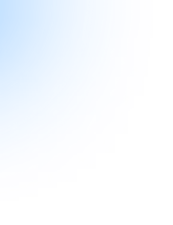
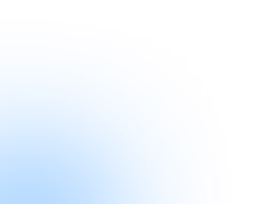
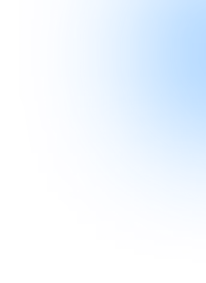
- Radial gradients simulate focused light, like a spotlight.

- Conical gradients rotate colors around a central point.

By mimicking gamma correction, shadow falloff, and ambient light, gradients can add depth and hierarchy to otherwise flat designs. You can learn more about color gradients in this video by Science and Tech Explorations:
Which types of color gradients actually work for brands?
Designers today have more gradient types to play with than ever and knowing when to use which is key.
Linear gradients for clean modern aesthetics
Linear gradients transition colors along a straight path. They’re ideal for:
- Background fills in web design
- Call-to-action buttons
- Minimalist branding elements
Radial gradients for focus and drama
Radial gradients expand color outward from a central point. Perfect for:
- App icons
- Product highlights
- Hero sections
Used right, radial gradients create a soft vignette effect that draws the eye inward which can be great for hierarchy and storytelling.
Multi-color gradients for brand recognition
Instagram’s 2016 rebrand set the tone for vibrant, multi-hue gradients. Their five-color scheme is now one of the most instantly recognizable palettes in the world. In 2025, brands continue to embrace bold, colorful palettes but with more care for accessibility and visual harmony.
What are the biggest color gradient mistakes everyone makes?
Accessibility and readability issues
Text on gradients is risky. If the contrast ratio between text and background falls below accessibility standards (WCAG 2.1), users with visual impairments will struggle.Here are some solutions:
- Use semi-transparent overlays behind text.
- Stick with high-contrast combinations.
- Test with color blindness simulators.
Overdoing the trend
Not every brand should jump into bright or aurora-style gradients. Overuse can lead to visual fatigue or brand confusion. Research and gather some market insights such as how younger demographics often prefer loud, saturated gradients. Older audiences tend to respond better to subtle transitions and minimal contrast.
How do I choose the right colors for my gradient design?
Choosing colors for a gradient isn’t just about taste but it’s also important to make a strategic decision grounded in color theory and brand alignment.
Color theory meets gradient design
Start with the color wheel. Consider:
- Complementary colors for tension and contrast
- Analogous colors for harmony and smooth transitions
- Warm vs. cool tones to control mood
A well-crafted swatch can set the emotional tone for a brand in seconds.
Brand alignment and target audience
Every industry carries color associations. Blues feel trustworthy (finance), reds evoke urgency (sales), and greens suggest eco-consciousness. Make sure your gradients speak the same language as your brand’s mission and market.
Where should I use color gradients in my design projects?
Gradients can live across a range of media, each with its own technical considerations.
Digital applications that actually convert
- Website backgrounds: use gradients to lead the eye toward CTAs.
- Mobile apps : onboarding screens and loading animations. Gradients keep interfaces lively.
- Social content: animated or looping gradients catch attention in scroll-heavy environments.
Print and physical applications
- Packaging: gradients create a sense of premium or fun quality, depending on how it’s used and the chosen colors.
- Business cards: a touch of gradient can elevate minimal designs.
- Posters and displays: large-format gradients pull the eye across a space.
However, when moving from screen to print, be aware of color space conversions (like RGB to CMYK) as gradients can shift unexpectedly or colors will not be as accurate.
What tools and techniques create professional color gradients?
Professional gradient design goes beyond dragging sliders.
Software solutions for every skill level
- Adobe Photoshop: still the gold standard, with fine-tuned control over color stops, opacity, and blend modes.
- Blender: shader nodes in Blender offer easily tweakable color gradients that can be added to any 3D model.
- CSS: for web-based gradients, native support in modern web browsers makes implementation seamless.
- Online generators: tools like CSS Gradient and Coolors offer fast inspiration and export-ready code for any created gradient to add into your websites.
- Figma: great for web and mobile prototyping and wireframes, and has a color gradient feature to help with designing.
Advanced techniques for 2025
- Grainy textures: add physicality and break digital perfection.
- Blur overlays: simulate motion or dream-like quality. Some also simulate a glass-like effect.
- Animated gradients: keyframe transitions in After Effects or CSS to make gradients breathe.
How are top brands using color gradients successfully?
Case study analysis
- Instagram: their gradient overhaul in 2016 is still paying dividends, creating cohesion across UI, branding, and marketing.
- Google: the subtle shift in their 2025 logo reflects a mature embrace of gradients without losing brand equity.
- Emerging brands: indie apps and DTC (direct-to-consumer) brands are adopting gradients as part of their launch identity for instant recognizability.
Measuring gradient design success
- User engagement: dynamic visuals increase session times.
- Conversion rates: gradients used on buttons and hero areas improve click-through.
- Brand recognition: bold gradients are easier to remember, especially across mobile platforms.
What’s the future of color gradient design beyond 2025?
Gradients aren’t going away, they’re evolving. Here are some predicted evolution patterns for 2025 or even the next following years:
Predicted evolution patterns
- Muted, natural palettes may replace saturated neon tones.
- Interactive gradients responding to mouse movement will become common in web design, similar to what we see here in this video by Madras Academy:
- Designers will rely more on functional gradients, where color transitions serve UX goals beyond just aesthetics.
Register Now and Get $50 FREE Credits!